This is a companion piece to All-Cause Mortality by Vaccination Status. If you have not read that post already, it will help make this post far more clear.
The United Kingdom’s Office for National Statistics released data that indicates substantially increased mortality rates in many individuals vaccinated with the COVID-19 vaccines, over the unvaccinated.
This is obviously concerning, and is rightly met with possible explanations for why the data might show this, while maintaining vaccine safety.
The most common of these explanations is derived from work by Professor Norman Fenton, Professor Martin Neil, Dr. Clare Elizabeth Honor Craig, and Joel Smalley. In previous work Fenton and Neil correctly and in a manner which is hopefully easily understood by the lay person, show that reporting delays in combination with group size changes can cause false mortality rate spikes to appear.
The existence and magnitude of these reporting delays in the actual data is not confirmed, and at the moment they could be argued ad nauseum. To sidestep that, it seems reasonable to make an attempt at finding the range of the error which this effect might be causing. I do so below, and the results showed the following.
With all possible shifts up to 1 month, the mortality rate for ‘first dose at least 21 days ago’ is substantially higher than ‘unvaccinated’ for any point from May 2021 on.
With all possible shifts up to 1 month, the mortality rate for ‘second dose at least 21 days ago’ is higher than ‘unvaccinated’ by December 2021.
We will once again be looking at Table 2 of the data linked above.
The animated time shifted data takes a bit of effort to generate, so for now I picked a single age band to work with. Spikes are the most obvious marker for the time shifting effect being present, so I started with 80-89 since it has the largest ones.
The mortality rates given in the data are all age standardized, even within the 10 year age bands. This means is that you can’t exactly replicate the numbers given by the ONS since they don’t provide the age of each individual. You however can get close enough that the outcome is reasonable, if using the age banded data. The all age data is not an acceptable target for the following method as the effect of the age standardization is great enough for the error to be quite large.
As an example, ‘January’ ‘80-89’ ‘unvaccinated’ ‘count of deaths’ is 17,346 and ‘person-years’ is 73,536. The mortality rate per person year is 17,346 / 73,536 = 0.23588. The mortality rate per 100,000 person years is 0.23588 * 100,000 = 23,588. Just to reaffirm, this means 23,588 deaths are expected per year in this category if rates remain the same. It is not exactly the 23,415.9 rate given by the ONS, but it is the best we can do and at least for that data point is off by under 1%. A chart of mortality rate data derived this way is fairly indistinguishable from the ONS rate to the naked eye.
To shift the data, we will use the ‘person-years’ given for the month we are looking at, but will start to use the ‘count of deaths’ from neighboring months.
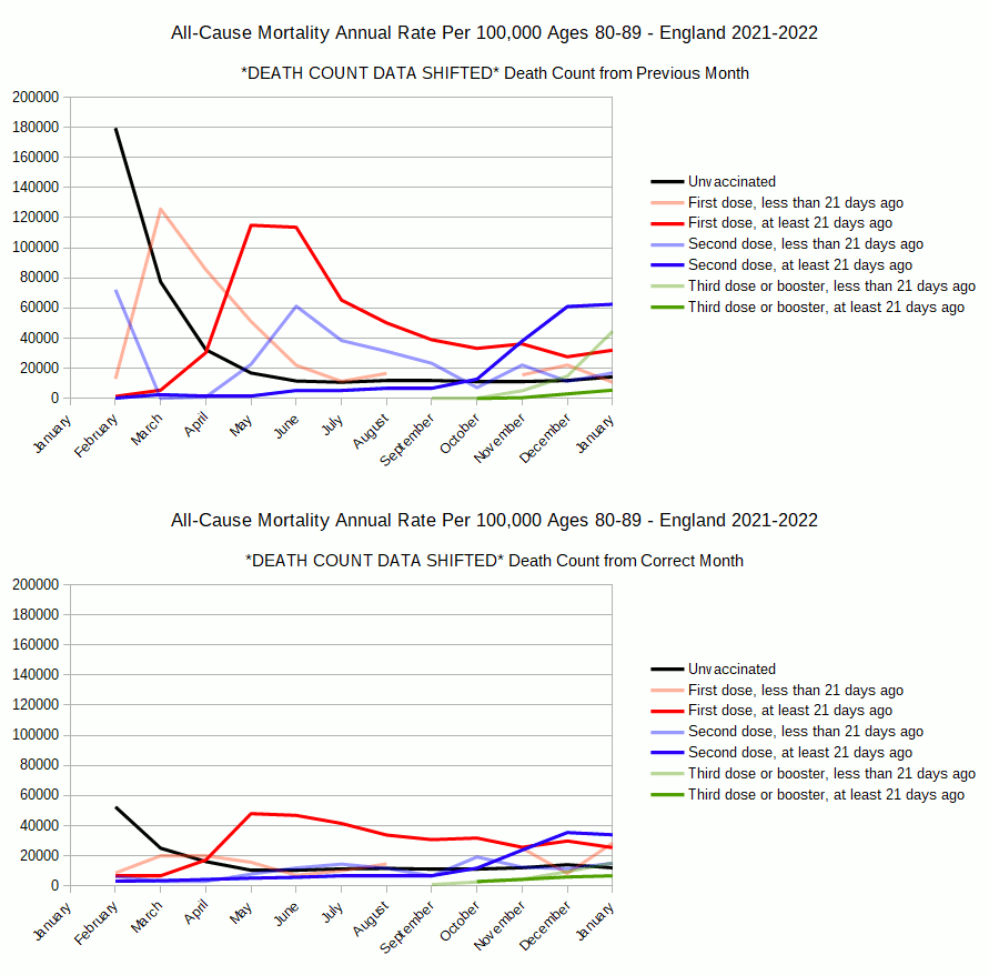
Using the previous months death count, will cause the following:
Mortality rates are falsely higher for groups that are shrinking over time. You are taking the death count from what was a larger group, so should be higher, and using it to determine a mortality rate for a population that is now too small.
Mortality rates are falsely lower for groups that are growing over time. You are taking the death count from what was a smaller group, so should be lower, and using it to determine a mortality rate for a population that is now too large.
Using the previous months death count is what we would do if we were compensating for a reporting delay in group population change due to vaccination. In other words if the group population size data was a month behind, the February population data would actually be January’s, so we should compare the February population sizes to the January deaths. Note that January 2021 will be missing from the chart since we don’t have December 2020’s data. When we analyze the data this way, we get the following chart.
Lets overlay this chart with one using the unshifted data to see changes.
Exactly as we expect, mortality rates go up for groups shrinking over time. ‘Unvaccinated’ get vaccinated. ‘First dose less then 21 days’ go over 21 days. ‘First dose at least 21 days’ gets their second dose. So on down the line, the spike effect in shrinking groups is even worse than in the original chart.
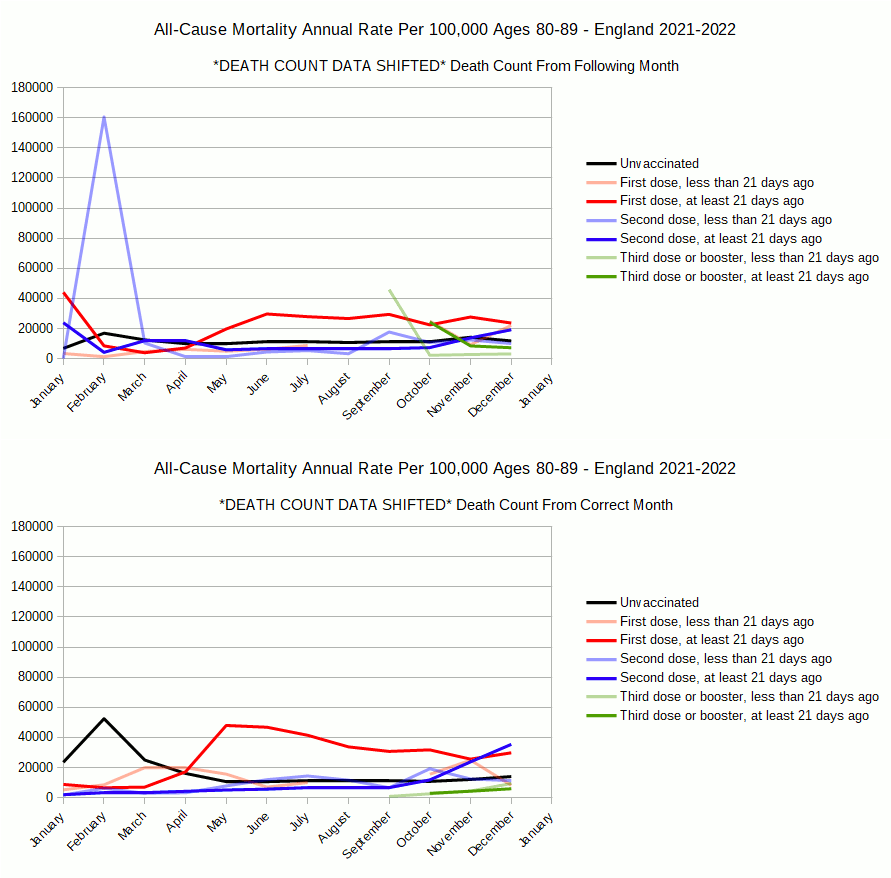
Using the following months death count has the exact opposite effect:
Mortality rates are falsely lower for groups that are shrinking over time. You are taking the death count from what is now a smaller group, so it should be lower, and using it to determine a mortality rate for a population that is too large.
Mortality rates are falsely higher for groups that are growing over time. You are taking the death count from what is now a larger group, so should be higher, and using it to determine a mortality rate for a population that is too small.
Using the following months death count is what we would do if we were compensating for a reporting delay in deaths. In other words if the death data was a month behind, the February death data would actually be January’s, so we should compare the February death count to January’s population. Note that January 2022 will be missing since we don’t have February 2022’s data. When we analyze the data this way, we get the following chart.
Lets overlay this chart with one using the unshifted data to see changes.
Again, it is exactly as we expect, mortality rates go up for groups growing over time. With this shift we see some substantial changes from the original data.
Importantly the spikes in the shrinking groups are reduced. However we now have a massive spike in the growing groups, especially in ‘second dose less than 21 days ago’.
Worse than that, the mortality rate for ‘first dose at least 21 days ago’ is still substantially higher than ‘unvaccinated’ by May 2021. The mortality rate for ‘second dose at least 21 days ago’ is still higher than ‘unvaccinated’ by December 2021. It also shows first, second and third doses ‘at least 21 days ago’ having higher mortality rate than ‘unvaccinated’, when those categories are first introduced to the population.
This is not a good chart for vaccine safety. Neither is the other extreme, or the original. Maybe shifting a month is just too much. Maybe if we do a smaller shift things will look better. In all likelihood, the data wouldn’t be a month delayed at its worst anyway. We are just setting some extreme boundaries.
We can make an attempt at a smaller shift of the data given, by doing a linear interpolation. We can use a death count that shifts weight from the original months death count to the neighboring months death count, by a certain percent. A 50% shift would be the average of the months.
Here are the results of doing that in 5% steps.
Regardless of weight, the mortality rate for ‘first dose at least 21 days ago’ is substantially higher than ‘unvaccinated’ for any point from May 2021 on.
Regardless of weight, the mortality rate for ‘second dose at least 21 days ago’ is higher than ‘unvaccinated’ by December 2021.
Lets just take what I would say is the the best case scenario for vaccine safety, 25% weight to the following month. Note that this is acting as an approximate correction for a hypothetical 1 week delay in death reporting. This is the chart with the greatest possible reduction in mortality rates we can generate for shrinking groups ‘first dose at least 21 days ago’ and ‘second dose at least 21 days ago’, before the growing groups ‘second dose less than 21 days ago’ and both ‘third dose or booster’ groups mortality rates become greater than ‘unvaccinated’ early in their reporting.
Rescaled it looks as follows.
Hopefully what I would call the ‘optimal’ of all possible charts speaks for itself.
I find it hard to accept the argument for statistical error due to time shift, given these results. Keep in mind this post is only looking at ages 80-89, is fairly crude, and done by an amateur. Professor Norman Fenton, Professor Martin Neil, Dr. Clare Elizabeth Honor Craig, and Joel Smalley discuss many other possible errors in the ONS data. It is not always clear what effect they would have on mortality rates. The topic of time shifting is quite popular in the replies to my previous post, so I hope this helps to illustrate it.


Without going into the nitty-gritty of the numbers manipulations, there are endless permutations on the behavior bias. For example, if we assume that the most sick and frail would opt for vaccination ahead of those that are hale and hearty, we would get the increase in mortality in the vaxed group. On the other hand, if those vaxed would feel over-confident in their protection and start behaving irresponsibly, the opposite would happen. The All-Cause-Mortality is an important signal that should alert the medical community and promote more insightful and stringent groups definition, as well as looking at the cause of death categories